
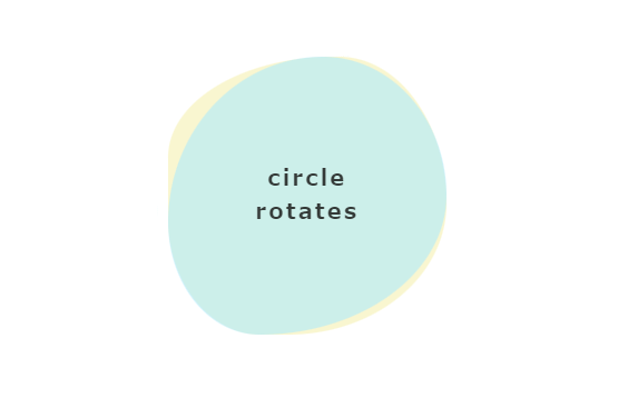
縁がうねうね動く円
See the Pen Untitled by nanami (@nanami_po) on CodePen.
<div class="wrap">
<div class="circle"></div>
<div class="circle02"></div>
<p>circle<br>rotates</p>
</div>
.wrap{
display: flex;
align-items: center;
justify-content: center;
padding: 50px;
margin: 50px auto;
max-width: 800px;
width: 100%;
height: 100%;
position: relative;
}
.circle,.circle02{
position: absolute;
top: 50%;
left: 50%;
transform: translate(-50%,-50%);
border-radius: 50%;
height: 200px;
width: 200px;
}
.circle{
background: #f5f0b0;
opacity: 0.6;
animation: circle_rotates01 6.0s ease infinite;
}
.circle02{
opacity: 0.6;
background: #aee9fb;
animation: circle_rotates02 4.0s ease infinite;
}
@keyframes circle_rotates01{
0%{
border-radius: 55% 45% 58% 42%/ 40% 55% 45% 50%;
}
50%{
border-radius: 70% 42% 65% 35%/ 40% 60% 55% 45%;
}
100%{
border-radius: 55% 45% 58% 42%/ 40% 55% 45% 50%;
}
}
@keyframes circle_rotates02{
0%{
border-radius: 65% 35% 54% 46%/52% 48% 52% 48%;
}
56%{
border-radius: 55% 45% 68% 32%/60% 50% 50% 40%;
}
100%{
border-radius: 65% 35% 54% 46%/52% 48% 52% 48%;
}
}
p{
color: #343a38;
font-weight: bold;
letter-spacing: 2px;
text-align: center;
z-index: 1;
}

