
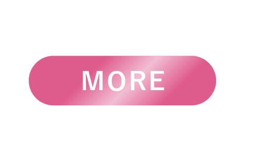
きらっと光るボタン
See the Pen Untitled by nanami (@nanami_po) on CodePen.
<a class="btn" href="url">MORE</a>a{
text-decoration: none;
}
@keyframes shiny {
0% { left: -20%; }
10% { left: 120%; }
100% { left: 120%; }
}
.bright_btn{
text-align: center;
margin: 80px auto;
}
.bright_btn a{
position: relative;
color: #fff;
background: #df5b8c;
overflow: hidden;
border-radius: 50px;
padding: 10px 60px;
}
.bright_btn a::after {
content: '';
position: absolute;
top: -10%;
left: -20%;
width: 40px;
height: 100%;
transform: scale(2) rotate(20deg);
background-image: linear-gradient(100deg, rgba(255, 255, 255, 0) 10%, rgba(255, 255, 255, .5) 100%, rgba(255, 255, 255, 0) 0%);
/* アニメーション */
animation-name: shiny;
animation-duration: 3s;
animation-timing-function: ease-in-out;
animation-iteration-count: infinite;
}
